Brief/Challenge
Way back in the day, I worked in a call center for health savings accounts. The most common issue was clients accidentally processed a withdrawal or a contribution which ends up tying up their money for 3-5 business days. The other call center representatives complained that the clients were just stupid but I decided to do some research on the issue using the resources I had.
Below, you will see the email I sent to management with my research findings and proposed solution ( a change to the User Interface on the website)
Solution
I have a suggestion for the PNC HSA Website.
I want to add one addition to the website in order to reduce calls and tickets as well. A lot of calls I get (and I am sure other reps get) is the call to reverse an ACH contribution or transaction due to a misunderstanding of the PNC HSA website. This is probably a weekly occurrence (if not more).
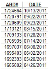
Here is a list of tickets I have personally created for this issue over the past few months:
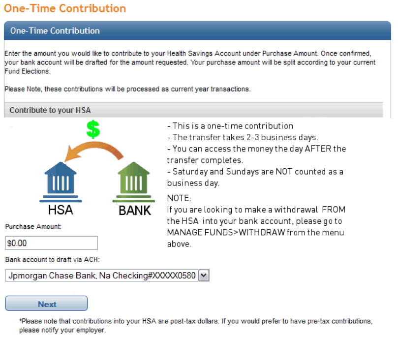
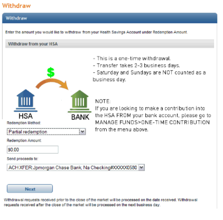
My solution is to have an image that summarizes the transfer options.
I have 2 reasons for this:
1) It will reduce calls and the number of tickets concerning this issue.
It will reduce calls to reverse these transactions. On average, I think it takes on average 3 calls to resolve one of these issues (The 1st is to report the issue and create the ticket, the 2nd is to confirm the reversal and the 3rd generally occurs if there are problems stemming from the reversal)
2) The pictures helps make contributions and redemptions easier to understand.
A lot of clients DO NOT read the fine print that is listed on each page, so having an image gives their eyes something zoom in on. That’s why I decided on a simple image with a bulleted list of the most important transfer details.
I hope to reduce the number of calls and callbacks and the number of tickets generated for this issue. The real problem is that a fair number of clients realize the error too late and they try to pressure the phone reps, the supervisors and AHD processors into getting things corrected in 24 hours when it is originally a user error. Due to the way the deposits/withdrawals are processed, reversals can take 3-5 business for the clients to get their money and then everyone is irate.
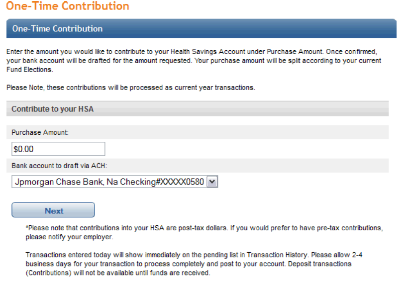
With that out of the way, here is an image of the PNC HSA website’s current setup for One-Time Contributions:
Here is my mockup for my suggestions to the One-Time Contribution page:
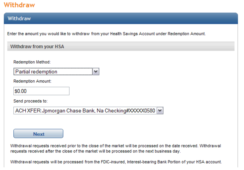
Here is the Original PNC HSA Withdrawal page:
Here is my mockup of the Withdrawal page:
Outcome
After my email was sent to management, the developers of the website implemented my solution within A WEEK. It actually came down to a terrible User Interface /User Experience which caused unnecessary confusion for the end user.
The end result? My personal calls on this issue dropped by 50% in the same time frame. The developers of the website implemented my solution within a week.
Imagine if the other representatives experienced the same drop in calls as well. How much time and money was saved from 15 minutes in Photoshop? Probably thousands.